→
HumanN
Helping Neogenis Labs Become HumanN (and Also, More Human)
Web Copy / Microcopy / Packaging
Overview.
Neogenis Labs was the maker of the supplements, Neo40, SuperBeets, and BeetElite. As their popularity grew, it was time to rethink their brand. How far can you really take a brand called Neogenis? They rebranded themselves as HumanN (the N standing for the ingredient, Nitric Oxide, which is its unique selling point). The next phase was to put it all into words and introduce the change to their many loyal customers.

Scope.
Team + My Role
At the time, I was freelancing with the great women at Hunt, Gather agency in Austin. We were a powerhouse team of three. One designer and two writers, including me. I wrote all the pieces you see here (and more), and was certainly set up for success by the amazing manifesto written by Kathy Horn, CD, at Hunt, Gather.
Goals
Introduce HumanN’s new look to existing customers
Reassure them that the products themselves hadn’t changed
Explain why the change to HumanN
Introduce the concept behind what it means to be HumanN
Process.
Timing to get everything in place for (re)launch was tight. Shocker, I know. But we were able to proceed in a mostly logical manner. Starting with an inspiring manifesto (not me), and then moving on to a messaging map (me) that included messaging for awareness phase, introductory phase, and education phase for Neo40, SuperBeets, and BeetElite. There was never an official style guide, but being that there was only two writers working so closely in developing the voice, we didn’t need one (nor was there time). We powered through dozens of deliverables over 3 months. Here’s a sample of them, written by yours truly.
Work.
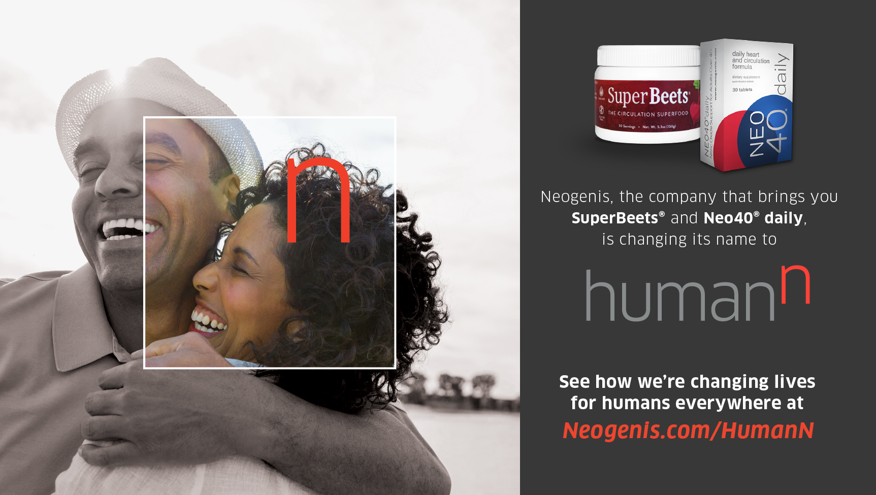
Splash Page
One of the first major pieces we created, the Splash page afforded us more time to write and design the main copy for the site, which needed many approvals, from marketing to legal. When the site was finished, we reformatted this page to be a permanent fixture under the Why HumanN tab. Check it out.

Pop-ups + Banners
We developed pop-ups and banners across several Neogenis.com experiences to alert customers to the coming changes in a way that generated excitement, not skepticism.


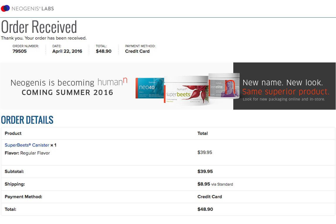
BeetElite, SuperBeets, and Neo40 products have a cult following. As such, it was very important to personally address the changes with them and let them know what to expect—mostly that their beloved products were not changing.

Packaging Insert
We redesigned the “Read Me First” packaging brochures for SuperBeets and Neo40 to incorporate the rebrand and address the new packaging.
Postcard
We really covered our bases—we also created this oversized postcard to send to current customers.

Appendix.
While we were creating all the “coming soon” communications, we were concurrently writing and designing the pages for the new website. I wrote quite a few of them (like this one, this one, this one, and this one), along with a newsletter, product emails, social posts, direct mail pieces, athlete bios, and product pages.